*If You Have Extra Time, There's More Ways To Shine!*
Shine BRIGHT Like A Diamond
Choose one of the following activities from Part One-Part Ten
In the back of your notebook, title and underline your work, "Time To Shine", be sure to include your name at the top. Write down which part you are going to be working on in your activity, follow along with the links or images and complete the questions.
YES! You HAVE to WRITE THE QUESTION DOWN.
YES! Your answers must be completed in full sentences, using proper spelling and grammer.
YES! You must give details and examples to support your thoughts in your answers.
YES! YOU MUST PRESENT YOUR WORK NEATLY!!!!!
Shine Time!
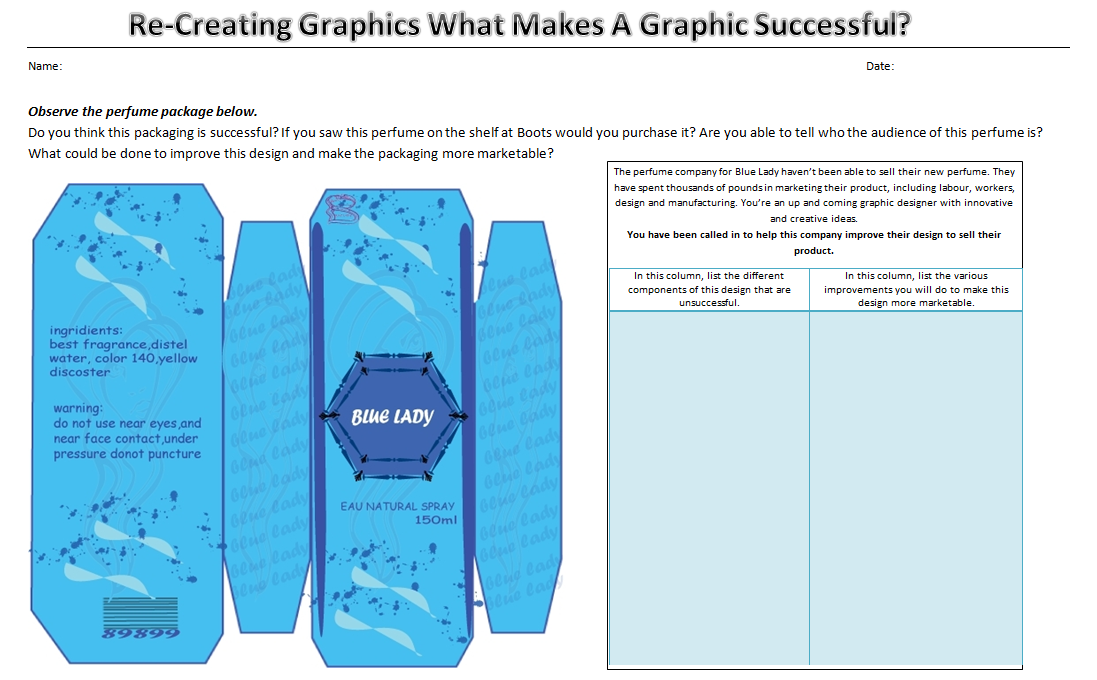
Think about your favourite perfume.
What would you want it to smell like?
What would you want the design to look like?
If you could change the name of the perfume, what would you call it and why?
In your opinion, what should perfume companies do differently to sell their product to many different types of audiences?
Part One:
Look at the differences in the graphics on the following link:
The advancement of graphics on cereal boxes:
http://www.buzzfeed.com/hgrant/15-examples-of-how-cereal-boxes-have-changed-over
1. What are some of the differences you notice immediately?
2. Can you identify the similarities between graphics over the years?
3. How can you compare the differences in graphics over the years?
4. What do you notice about the font and text choices and designs of the graphics from years ago, until now? Give examples.
5. What do you notice about the colour choices and designs in the graphics from years ago until now? Give examples.
6. In your opinion, has the improvement of technology helped graphics become more successful in adverts?
7. Do you think graphics are important in our society/world? Why or why not?
8. Can you assess the most important aspects or things about graphics and what they do?
Part Two:
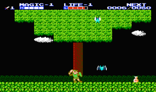
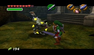
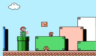
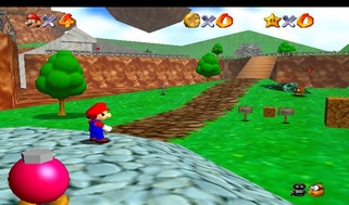
The Evolution of Graphics in Video Games
Graphics in Video Games:
http://www.youtube.com/watch?v=xz-1tAeB868
Super Mario Over The Years
Judging by the images of the evolution of graphics in video games, could you predict the outcome of how the graphics for Super Mario or Zelda will look in 5 years? What about in 10 years? Use examples to support your theory.
Part Three:
Video Games and Realism
A Communication Professor Studies Effects on Children By Cheryl Walker
Click on the link and read through this article on video-game graphics.
http://news.wfu.edu/2010/12/22/video-games-and-realism/
Answer the following questions:
1. Summarize this article in your own words.
2. Can you explain whether the writer believes that the growing realism in video games is a positive or negative thing?
3. Compare the positive and negative effects of which she speaks of in this article, with your own experiences with video games.
4. Judge what the value is to having more realistic graphics in video games. Explain your thoughts in detail.
5. In your opinion, do you think that video games have more of a positive effect on children, or a negative effect? Be sure to defend your answers with solid examples.
6. If you could convince one of your parents or teachers that video games do in fact have more of a positive effect than a negative effect on you, what would you say? How would you convince them? Use details and examples to explain your ideas.
Part Four:
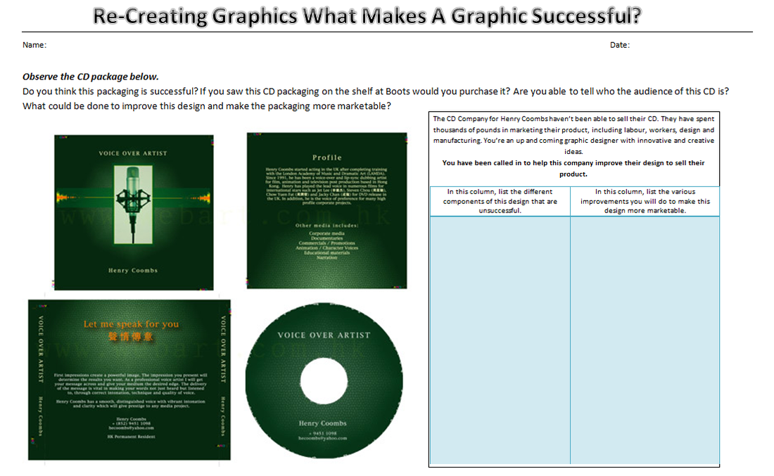
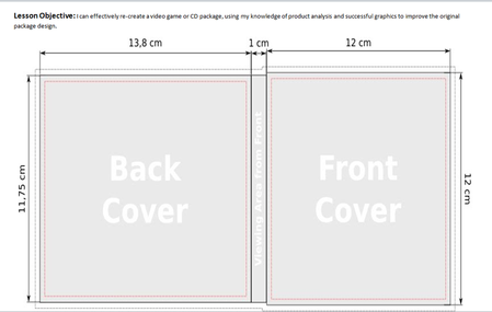
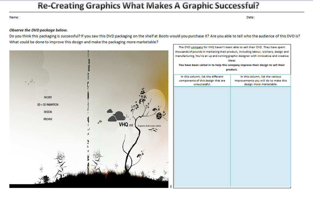
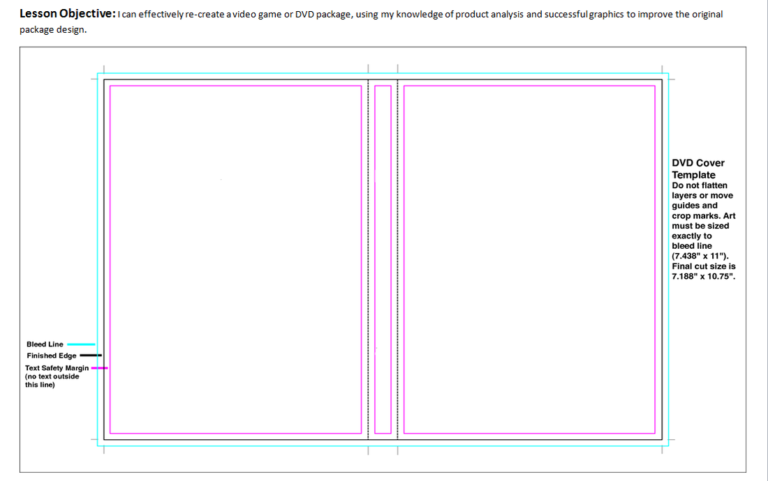
Analysing and Examining the Evolution of Graphics Through Posters, Film Covers and CD Covers.
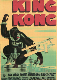
King Kong
What are the features of each graphic advert?
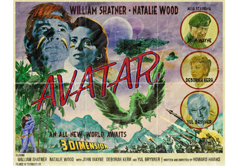
Avatar
What could be done to improve the image on the left? In your opinion do you think the graphics on the right have improved the image on the left? What examples can you use to support your ideas?
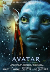
What could be done to improve the image on the left? In your opinion do you think the graphics on the right have improved the image on the left? What examples can you use to support your ideas?
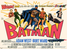
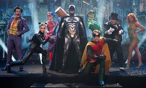
Batman
a) Would it be better if graphics continued to use graphic images, texts and symbols instead of incorporating or adding real people or objects? Why or why not?
b) What facts can you compile to prove how these three graphics below have evolved (improved) over the years?
c) Do you agree that advertisements are more effective and successful when the graphics are really eye-catching, detailed and interesting to the audience like the image on the right? Explain your thoughts.
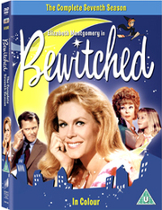
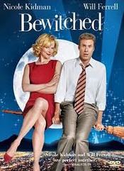
Bewitched
The below two advertisements include graphic images, symbols and text, as well as rea objects and people, similar to the Dark Night advert on the top right.
How would you compare the similar, yet very different ideas/presentation of the people and graphics within each advert?
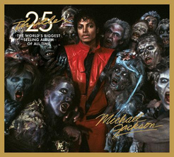
Michael Jackson
The graphics on these two cd covers are very different from one another, but still very effective. How would you justify the different choices each graphic designer made, in order to make these different covers successful in their designs? Give examples for your reasoning.
Part Five:
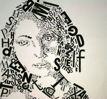
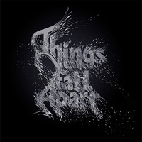
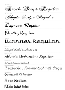
a) What is the relationship between the different kinds of typoggraphy used below?
b) Can you identify the different ways each typography can be used in advertising?
c) If you were the head of an advertisement company, what style of typography would you recommend your employees use to sell your product? Why would you say that?
Part Six:
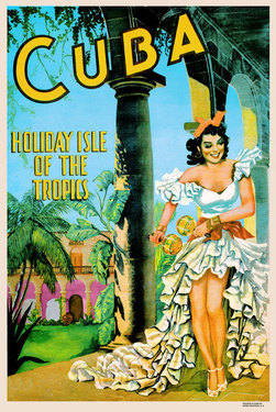
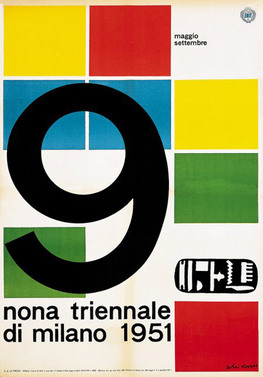
Decades of Graphic Design...1950s-1970s...A Blast From the Past
The 1950s
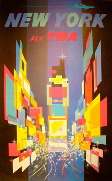
Advertisers in the 1950s always seemed to leave their viewers and audience's feeling happy. The graphics were designed by using soft tones in a water-colour like feel, simple images and fonts. The messages in these adverts are straight to the point, and easily understandable for any audience.
Look at the following adverts from the 1950s...
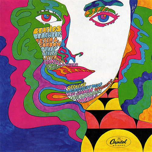
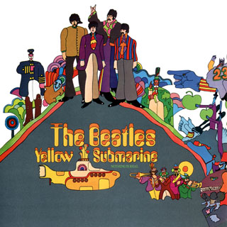
The 1960s
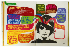
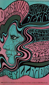
There was an evolution of design as the 1960s approached. Adverts and graphics began moving slightly away from soft water-colour tones, and began moving towards earth-tone colours. Ideas of psychedellic, groovy colours, distinctive contrasts from different designers and more experiementation with lithography, animation, illustration and editorial design. Fonts types became more fluid, using bubble letters and different forms of displaying text.
Look at the following adverts from the 1960s...
The 1970s
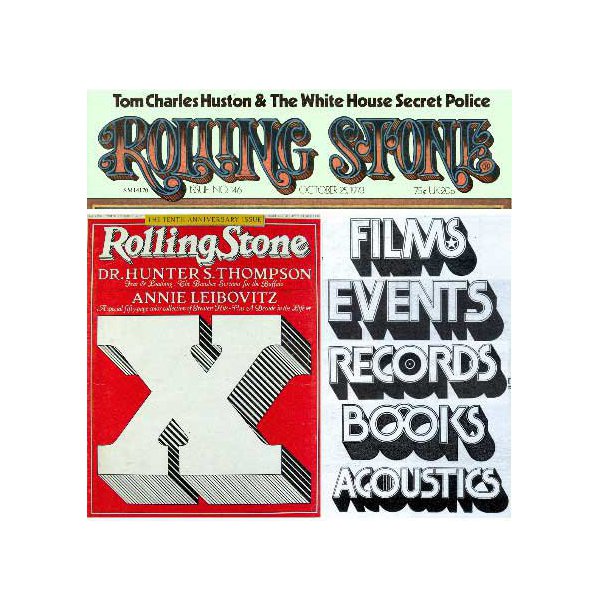
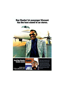
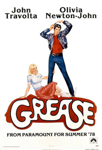
The evolution in advertising using graphics continued throughout the 1970s. Advertisers began showing more close-ups of people's faces which showed their satisifcation with the products being sold, older cartoon-drawings of animals were being replaced by happy looking human beings. The 1970s became a highlight of experimentation in the graphic world.
Look at the following adverts from the 1970s...
1. What are the similarities and difference between these three different years of graphics?
2. How has graphics been evolutionized as the decades increase?
3. What is the main difference between the graphics of the 1950s-1970s and the graphics that are seen today?
4. In your opinion, which graphics are most effective and why?
Part Seven:
Creating Bumper Stickers
Materials
|
1. Brainstorm on words for "your country" What does your country stand for. Record words on A3 paper. 4. Outline with black permanent markers Share with other students if time remaining. |
Examples of Different
|
Part Eight:
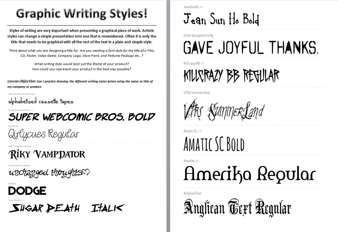
Practicing Writing Styles and Various Fonts
1. Complete the following worksheets on a seperate piece of A3 paper. Your title is "Graphic Writing Styles"
2. Choose a company logo name, perfume package title, CD title, Film title etc.. and re-create the title or word(s) using the different fonts below:
Part Nine:
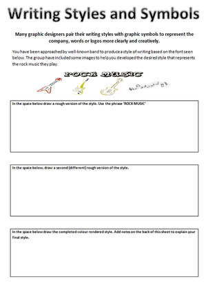
Before completing a finalized design, graphic designers create different versions of their writing styles, titles and logos to see which design best matches the theme of the company or product. Along with graphic writing styles, fonts are accompanied by different symbols of representation as well.
Complete the following worksheets according to their instruction.
Part Ten:
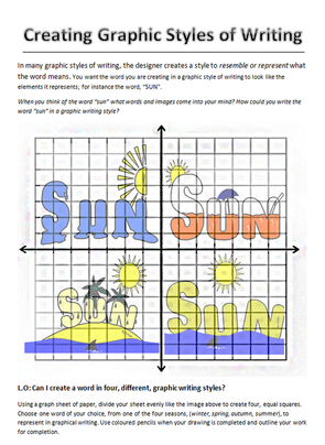
Graphic Styles of Writing
In this worksheet, you can see different examples of graphic writing styles for the word "sun".
|

