Basic Colour Skills; Mixing and Blending Art Activities
Lesson Objective: Can I blend different pencil colours to match the same colours used in magazine strips?
Key Term: |

|

|
|
|
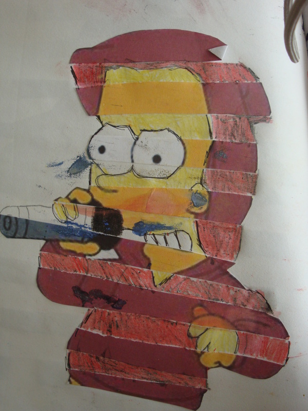
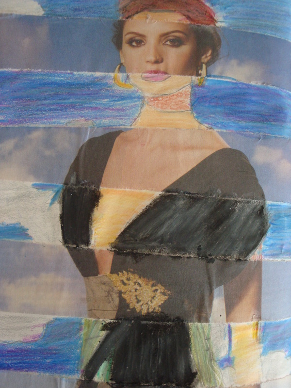
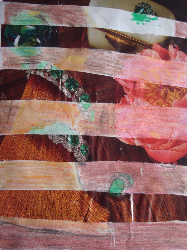
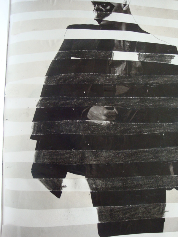
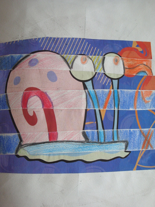
Magazine Art
1.Begin with a full magazine sheet of magazine. This sheet should be very eye-catching (colour and pattern), as well as SIMPLE.
2.Using a ruler, evenly divide your magazine into 7-10 equal strips- horizontally across the page.
3.On a seperate sheet of blank paper or sketchbook paper, glue on EVERY OTHER strip of your magazine page, so that there are equal gaps of magazine vs. blank sheet.
4.Once your strips are glued down you should be able to clearly see that there are patterns/colours missing from those blank
sheets.
5.With pencil, begin filling in the missing lines on the blank strips of your paper (attaching them to the lines from the magazine strips, so it looks like one large picture/image). (Use the other magazine strips that were not glued on, as a guide to what lines should be drawn in the blank spaces of your sketchbook)
6. Once you have completed putting in the lines, you can begin colour mixing with your coloured pencils to find the appropriate colour to match. REMEMBER: Aside from the PRIMARY COLOURS, most colours are made up of more than one colour, so you must look at your magazine image carefully and mix different coloured pencils together to find the matching colour.
7. Remember to colour in the spaces really hard with your coloured pencil so that the colour will make the magazine image appear as though the other strips have not been cut out and coloured in from far away!
8. Complete you work! Your work should look as though the other magazine strips were never taken away!
|
|
|
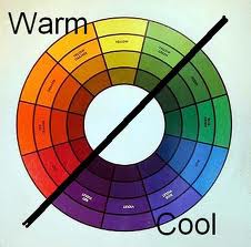
Warm vs. Cold Colour Mixing
Warm Colours:
|
|
Cold Colours:
|
Different Art Assignments Using Warm and Cold Colours
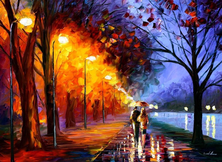
Observe the following image below.
Is this work attractive?
How do the warm colours on the left make you feel?
Do you get a different feeling from the cold colours on the right?
Do you think that using different colours create a different mood in a piece of art work? Why or why not?
Why do you think the artist (Leinoid Afrenov) decided to paint this piece with the warm and cold colours divided?
Various Levels of Warm and Cold Art Projects
Differentiated Studies. Students to choose which assignment they'd like to create.
Junior
1. On a blank sheet in your sketchbook, choose a starting point to create your first circle. You can choose the center of the page or a corner or somewhere in between.
2. Create the circles using a protractor to create equal and various circle lines until your sketchbook page is completely covered. 3. Once your circles are created, outline your hand in pencil to create a variety of lines. 4. Using coloured pencils, colour in the background using warm colours or cold colours. 5. In the hand, choose the opposite colours from the background. 6. Choose a small symbol (similar to the heart in the example above), which represents you to place in the middle. Colour it according to which colour scheme you have chosen for the background. |
Intermediate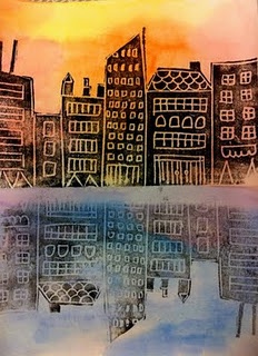
1. On a blank sheet of sketchbook paper, divide your page into two equal sections.
2. Using water-colour paints create a background using the warm colours of your colour wheel. Allow the paint to create water droplets on your page to create the textured look of clouds. 3. Use the cold colours of your colour wheel and create a light wash on the opposite side of your page. 4. Using polystyrene, carve in the buildings and details; keep in mind that everything you draw will be backwards when it is printed. 5. Roll printmaking ink onto the front of your design and place the polystyrene down onto the background of your sketchbook. Roll a clean roller over the polystyrene to allow the ink to stick to the page. 6. Carefully peel off the card and re-place it upside down like a reflection in the cold colour section of your sketchbook. Not reapplying the ink will allow the bottom section of your work to look as through the buildings are being reflected in the water. |
Senior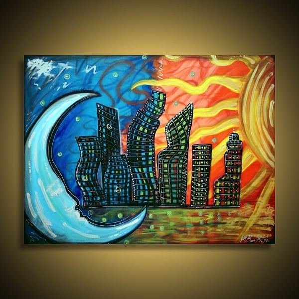
1. On a blank sheet of sketchbook paper, divide your page in half.
2. On the left hand side, draw a large-scale moon, on the right hand side a large scale sun. Use the example painting as a reference for your work. 3. In the middle of your page, sketch various one-dimensional buildings from the examples below. Keep the designs simple. Remember to keep enough space at the bottom of your page to create a reflection in the water. 4. Using the cold colours of your colour wheel, paint the sky and the moon. 5. Do the same thing on the opposite side of your page with the warm colours of your colour wheel, 6. Mixing the cold and warm colours, create a reflection of water, by painting strokes of lines. Add a little black colour to reflect the buildings. 7. Begin painting the buildings in black, adding details to the windows using different shades of white and grey. 8. Complete your painting by outlining different components of your painting. Add extra detail in lines and strokes with other colours of paint in the background; use the example above to guide you. |
